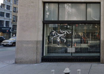
The Arc'teryx logo depicts the skeleton of the Archaeopteryx, a 150-million-year-old transitional species between dinosaurs and birds. It's based on the Berlin Specimen discovered in Germany in 1877. Designer Michael Hofler created the minimalist skeleton design showing the prehistoric bird in flight. The logo represents the brand's philosophy of evolutionary advancement in outdoor gear. Founders Dave Lane and Jeremy Guard chose it when rebranding from Rock Solid to Arc'teryx in 1991. Only 14 Archaeopteryx fossils exist worldwide. The Berlin Specimen remains the most complete example, making it ideal for the iconic logo.
What Does the Arc'teryx Logo Represent?
The Arc'teryx logo features the Archaeopteryx, a prehistoric bird that lived 150 million years ago. It lived during the Late Jurassic period. This creature occupies a pivotal position in evolutionary history. It's a transitional form between reptilian dinosaurs and modern birds. This makes it the perfect symbol for a brand focused on evolutionary advancement.
The skeleton comes from the Berlin Specimen. German archaeologist Jakob Niemeyer discovered it in 1877 near Solnhofen in Bavaria, Germany. This fossil represents the most complete Archaeopteryx remains ever found. It was the first to preserve the creature's head. The Berlin Specimen now resides in Berlin's Natural History Museum.
Only 14 Archaeopteryx fossils have been discovered. All come from the Solnhofen limestone deposits in southern Germany. Arc'teryx chose one of the rarest fossils to help understand flight evolution. They transformed a 150-million-year-old skeleton into a globally recognized brand symbol.
How Was the Arc'teryx Logo Designed?
Designer Michael Hofler created the Arc'teryx logo using the Berlin Specimen as his reference. The design takes a minimalist approach. It shows the Archaeopteryx skeleton with clean lines that capture the essential form. The logo presents the skeleton in a horizontal flying posture. Wings spread and head turned, creating motion and dynamism.
The logo typically appears in white on black backgrounds. It's also used on black-on-light backgrounds. This high-contrast presentation ensures visibility from jacket labels to billboards. The clean vector format maintains sharpness at any size.
The skeletal bird design stands out from typical outdoor brand logos. Most rely on mountain peaks or bold text. Instead, the Archaeopteryx fossil tells a story of innovation. The striking visual prompts viewers to ask wearers about the brand.
Why Did Arc'teryx Choose This Name and Logo?
Founders Dave Lane and Jeremy Guard rebranded from Rock Solid Manufacturing to Arc'teryx in 1991. They wanted a name that reflected their commitment to advancing evolutionary design in outdoor gear. The Archaeopteryx represented exactly this. It was a creature that made an evolutionary leap forward. It developed feathers for flight to escape the horizontal world of dinosaurs.
The name and logo communicate that Arc'teryx doesn't focus on incremental improvements. They focus on radically advancing the status quo. The Archaeopteryx bridged the gap between land-dwelling dinosaurs and flying birds. Similarly, Arc'teryx aims to bridge the gap between conventional gear and revolutionary technical equipment. This philosophy permeates everything the company creates. From early climbing harnesses to modern technical apparel.
By 1991, Arc'teryx had established itself as an innovator. The Vapor climbing harness used heat laminate technology. The new name and logo signaled expansion beyond climbing equipment. It maintained focus on technical excellence that other brands couldn't replicate.
What Makes the Logo Design Unique?
The minimalist skeletal design differs dramatically from competitor logos. Brands like Patagonia use mountain silhouettes. The North Face employs stylized peaks. Arc'teryx presents an actual fossil skeleton carrying scientific significance. This makes the logo instantly recognizable.
The horizontal flying posture creates visual movement. The wings spread wide, suggesting capability. The turned head adds asymmetry, preventing the design from feeling static. These choices transform what could be a morbid skeleton into a dynamic symbol of progression.
The logo has become iconic. Arc'teryx is colloquially known as "the dead bird brand" among outdoor enthusiasts and urbanites. The fossil skeleton transcends language barriers. This makes it ideal for a global technical outdoor brand.
The Arc'teryx logo represents more than corporate branding. It embodies a philosophy of continuous evolution and technical excellence. From the Berlin Specimen to Michael Hofler's minimalist design, every aspect reflects a commitment to advancing beyond limitations. The Archaeopteryx skeleton serves as a reminder. Innovation requires evolutionary leaps, not just incremental steps. Here is a full list of every Arc'teryx Beanie and Toque Model.